Aside from compiling a treasure trove of data, the post brings to light some interesting observations, not necessarily central to the author’s core arguments.
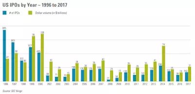
Take, for example, this chart:

The post correctly views this as evidence that both volumes and numbers of IPOs have been relatively steady over the recent years. Albeit, both are running woefully below the pre-dot.com bust era averages. And, as other evidence presented shows, this is not the feature of the dot.com bubble build up phase: in fact, numbers of IPOs have been running well below the 1980-2000 average since the dot.com bust.
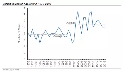
Maturity to IPO duration is also longer:

Which, of course, supports higher median IPO size in the chart above. Controlling for this, the collapse in IPOs activity in 2001-2018 period is probably much more dramatic, than the first chart above indicates. Or, put differently, IPOs are now more concentrated in the space of older, and hence more able to raise funds, companies. That is a phenomenon consistent with concentration risk rising.
It is also a phenomenon consistent with the hypothesis that entrepreneurialism is declining in the U.S. as younger, more entrepreneurial ventures are clearly less capable of accessing public equity markets today than in pre-2001 period.
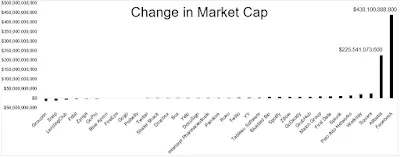
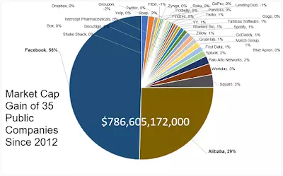
There is a lot, really a lot, more worth reading in the post. But here are two more charts, speaking directly to the issue of concentration risk:

and

Yes, the markets are dominated by a handful of stocks when it comes to providing returns. Namely, Facebook and Alibaba account for a whooping 85% of the total market cap gains since 2012. $85 of each $100 in market cap increases went to just these two companies.
This is concentration risk at work. Even tightly thematic investment strategies, e.g. ESG risk hedging investments, cannot avoid crowding into a handful of shares. Any tech sector blowout is going to be systemic, folks.


